Table of Contents
Ask ten sellers what their Amazon Brand Store looks like and most will describe a homepage, a couple of category pages, and a vague sense that "it should probably have more structure." Ask what belongs on each page, in what order, and why - and the answers get much less specific.
That's not a knowledge problem. Amazon's own advertising team publishes solid best-practice guidance, and so does most of the agency content ranking for storefront topics. What's missing isn't advice - it's a blueprint. A page tree. A tile-by-tile map of what goes where and why, scaled to how big your catalog actually is.
Store architecture, defined simply: the structural plan behind your Brand Store - how many pages it has, what each page's job is, how they connect through navigation, and which of Amazon's tile types serves each job - decided before a single hero image gets designed, not improvised page by page as you go.
This guide is that blueprint.
The Core Hierarchy: Home → Category → Product
Every well-structured store follows the same basic shape: a homepage that orients the shopper and sells the brand, category or collection pages that narrow the browse, and a clear path from either straight to a product detail page. The mistake most sellers make isn't getting this hierarchy wrong - it's applying the same hierarchy regardless of how many products they actually have to organize.
Small catalogs (under 15 SKUs)
Structure: Homepage + 2–3 subpages, no deeper. With this few products, additional category layers create clicks without adding clarity - a shopper hunting through three menu levels to find one of eight products is a worse experience than seeing most of your catalog on the homepage itself. Use one homepage built around a product grid and brand story, plus two or three subpages organized by genuine use-case difference (not by artificial category-splitting for its own sake).
Mid-size catalogs (15–50 SKUs)
Structure: Homepage + 4–6 category subpages + occasional campaign pages. This is where Amazon's own general guidance - keep navigation to roughly five to seven items - actually starts to apply cleanly. Organize subpages by how customers naturally think about your range (by product type, by use case, or by collection), not by your internal SKU logic. A seasonal or campaign subpage is worth adding here temporarily around major sales events, then folded back into the permanent structure afterward.
Large or multi-line catalogs (50+ SKUs)
Structure: Homepage + primary category subpages + secondary sub-navigation within pages. At this scale, a flat five-to-seven-page structure stops working - you either cram too much into each subpage or blow past Amazon's recommended navigation depth. The fix isn't more top-level pages; it's smarter use of within-page navigation (product grids with filtering-style groupings, shoppable image tiles that route to sub-collections) so the top-level menu stays clean while deeper organization happens inside each page.
The Homepage Blueprint, Tile by Tile
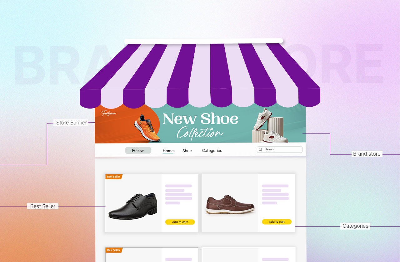
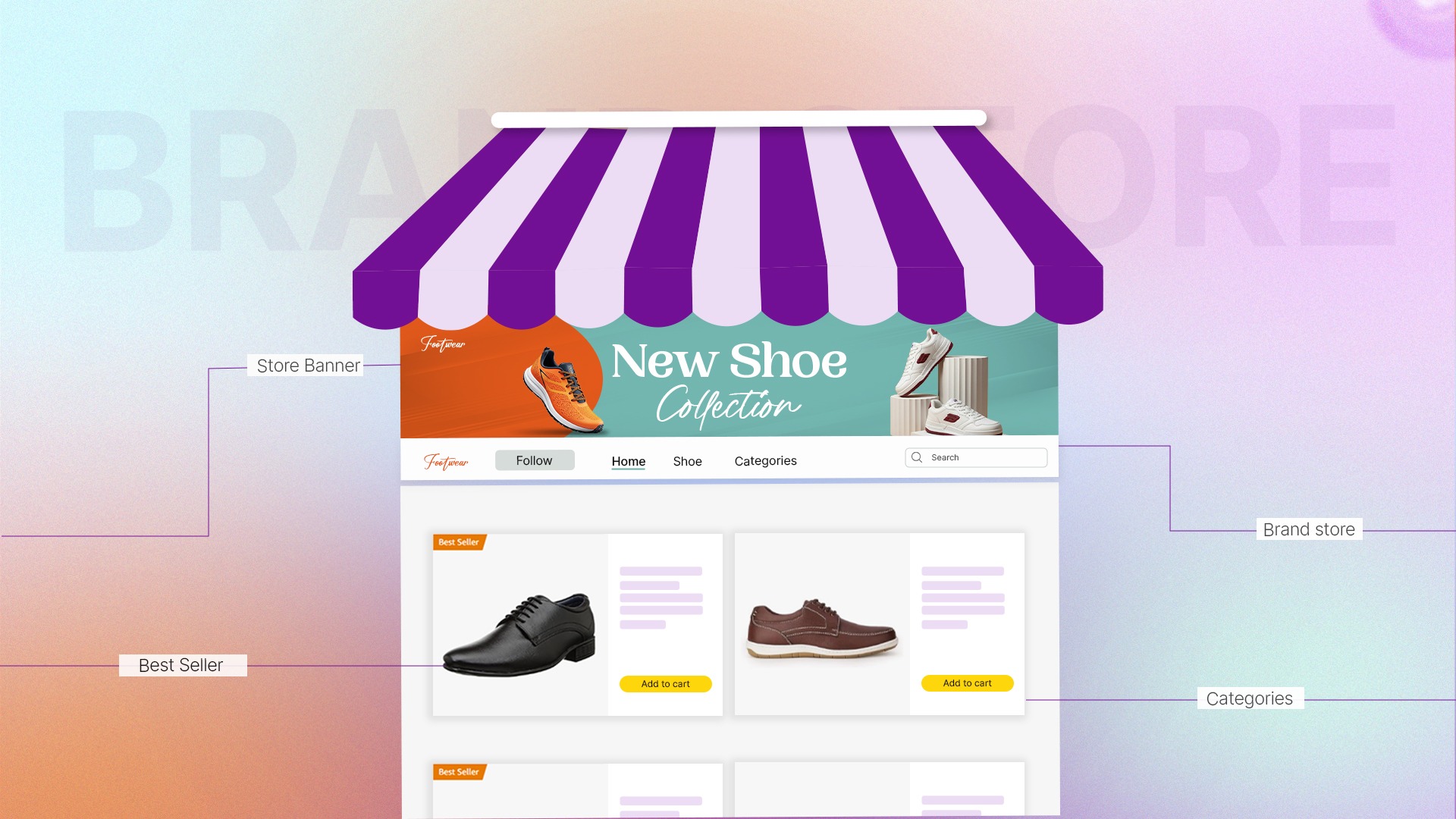
The homepage carries more weight than any other page in the store - it's what most traffic lands on first, from the brand byline, from Sponsored Brands ads, from external links. Here's the tile-by-tile build, using Amazon's actual tile types.
Header - hero image, logo, navigation bar. Amazon requires a minimum 3,000 × 600px hero image and a 400 × 400px logo, and reserves a "safe zone" in the center of the hero image since up to 30% can be cropped on some devices. This is the single highest-visibility asset in the entire store - treat it with the same design attention as your main listing image, not as a banner afterthought.
First content tile - the brand story block. Immediately below the header, a text-and-image tile stating your value proposition in one sentence, backed by a supporting lifestyle image. This isn't the place for a paragraph of brand history - it's a five-second read that tells a new visitor what you make and why it matters, before they've committed to scrolling further.
Second tile - product grid or best-seller tile. A full-width product grid (4+ products) or, if your store is linked to your brand's catalog, an automatic best-seller tile showing your top 5 performers. This is where browsing actually starts - get it above the fold or as close to it as the brand story block allows.
Third tile - featured collection or seasonal tile. A shoppable image or medium-tile collection highlighting either your flagship product or a current seasonal push. This is the natural home for Q4 or campaign-specific creative without disrupting the permanent structure around it.
Closing tile - cross-sell or "shop by category" navigation. A visual index into your subpages, useful for shoppers who scrolled the whole homepage without converting and need a clear next step rather than scrolling back up to the nav bar.
Subpage Architecture: What Each Page Type Needs
Not every subpage should look like a smaller homepage. Each page type has a distinct job.
Category pages exist to narrow, not to persuade - lead with a product grid, keep brand-story content minimal (a single line reinforcing why this category fits the brand), and prioritize filterable or logically grouped product tiles over decorative content.
Flagship or hero-product pages exist to persuade in depth - this is where a full narrative (problem, solution, proof, use cases) earns its space, closer in spirit to an extended A+ Content module than to a category page.
Seasonal or campaign pages exist temporarily - built for a specific promotional window, using the featured deals tile where applicable, and either folded back into permanent navigation or removed once the campaign ends rather than left live and stale.
Navigation Rules That Actually Hold at Scale
Every competitor guide agrees on "keep navigation clear," but the specific reason it breaks down is worth naming: navigation fails when category names reflect internal product logic instead of how a customer actually thinks about the choice in front of them. "Model A2200 Series" makes sense on a spec sheet. "Wireless Earbuds" makes sense in a nav bar. When subpages are named for a shopper's mental model rather than a SKU naming convention, the five-to-seven-item guidance holds even for genuinely large catalogs, because each item groups intuitively instead of requiring the shopper to already know your product line to guess which page they need.
Tying Storefront Architecture to A+ Content and Listings
A store built in isolation from the listings feeding it creates a visible seam - a shopper lands on a beautifully designed homepage, clicks into a product, and hits a listing with a completely different visual language. Store architecture, A+ Content, and listing image design should be planned as one system, not three separate projects handed to three different people: the same color palette, the same photography style, the same brand voice carrying through from the storefront hero image, into the A+ Content modules, into the listing's own lifestyle images. This is exactly the coordination a single dedicated Amazon visual designer working across your full catalog is positioned to maintain - and exactly what breaks down when storefront, A+ Content, and listings are each outsourced separately.
Quick Reference: Store Architecture by Catalog Size
If your store's structure is more "grew organically" than "planned architecture," book a discovery call and get a page-by-page blueprint built around your actual catalog size - not a generic template.
How to Brief a Designer for Full Store Architecture
A useful store brief goes beyond "make it look good" - it should specify: your catalog size and how you want it organized (use this guide's size tiers as a starting point), which products are flagship/hero-worthy enough for a dedicated subpage, brand guidelines that already govern your listings and A+ Content, and a note on which seasonal or campaign pages you'll need built temporarily throughout the year. Briefed this way, a dedicated Amazon designer builds the whole architecture as one coordinated project - homepage, subpages, and the visual thread connecting them back to your listings - rather than a series of disconnected page requests that each solve their own problem without solving the system.
FAQs: Amazon Brand Store Architecture
How many pages should an Amazon Brand Store have?
It depends on catalog size: under 15 SKUs typically needs just a homepage plus 2–3 subpages, 15–50 SKUs works well with 4–6 category subpages, and 50+ SKU catalogs are better served by keeping top-level pages around 5–7 and pushing additional depth into in-page navigation rather than adding more top-level pages.
What's the difference between an Amazon Storefront and a Brand Store?
An Amazon Storefront is an automatically generated, non-customizable page listing all of a seller's products, available to any seller. A Brand Store is the fully customizable, multi-page version available only to brands enrolled in Amazon Brand Registry, with custom navigation, hero imagery, and tile-based layout control.
How many categories should an Amazon Store navigation have?
Roughly five to seven top-level items is the general guidance, though the right number depends on catalog size - smaller catalogs should use fewer, and larger catalogs should resist adding more top-level items past that range by organizing further inside each page instead.
What goes on the Amazon Store homepage vs. subpages?
The homepage should orient a new visitor fast - brand story, top products, and a path into the rest of the store - while subpages should each serve one focused job: narrowing a category, telling a flagship product's deeper story, or supporting a time-limited campaign.
What are the tile size requirements for an Amazon Store hero image?
Amazon requires a minimum 3,000 × 600 pixel hero image, with up to 30% potentially cropped on some devices (15% from each side), so all essential visual and text elements should stay within the center safe zone.
Should a small brand structure its store differently than a large one?
Yes - a small catalog with fewer than 15 SKUs generally performs better with most products visible on the homepage and only 2–3 subpages, since additional category layers add clicks without adding clarity when there isn't much to sort through in the first place.
How does the storefront connect to A+ Content and product listings?
They should share one visual system - the same color palette, photography style, and brand voice - planned together rather than designed separately, since a shopper clicking from a polished storefront into a visually mismatched listing experiences a jarring, trust-eroding seam.
What's a shoppable image tile and when should I use one?
A shoppable image tile lets shoppers interact with up to 6 embedded product points within a single lifestyle image, each linking to its own product detail page - useful for featured collections or flagship-product homepage sections where you want strong visual storytelling paired directly with a purchase path.
How often should an Amazon Brand Store be updated?
Amazon's own data shows stores updated within the past 90 days see meaningfully higher repeat visitors and attributed sales per visitor, so treat quarterly refreshes as a floor, with additional updates around major product launches, seasonal campaigns, and promotions.
Who should design an Amazon Brand Store - in-house, freelancer, or agency?
Whoever builds it should be the same team (or at minimum the same coordinated brief) responsible for your listing images and A+ Content, since the biggest architecture failure isn't a bad individual page - it's a storefront that looks disconnected from the listings it's meant to funnel shoppers toward.