.webp)
Table of Contents
Introduction
Your product is live. Reviews are building. Ads are running. But something still isn't clicking - traffic comes in, and buyers leave.
Most Amazon sellers blame the price or the star rating. In most cases, the real problem is the A+ content design.
According to Amazon, listings with A+ content can increase sales by 3–10% on average, and well-optimised Premium A+ modules can push conversions up by as much as 20%. That's not a small gap - and it's almost entirely a design problem.
This guide covers 9 specific design signs that your Amazon A+ content is costing you sales, along with the exact fixes for each one. Whether you're handling it in-house or working with a professional Amazon graphic designer, these are the issues worth addressing first.
What Is Amazon A+ Listing Design?
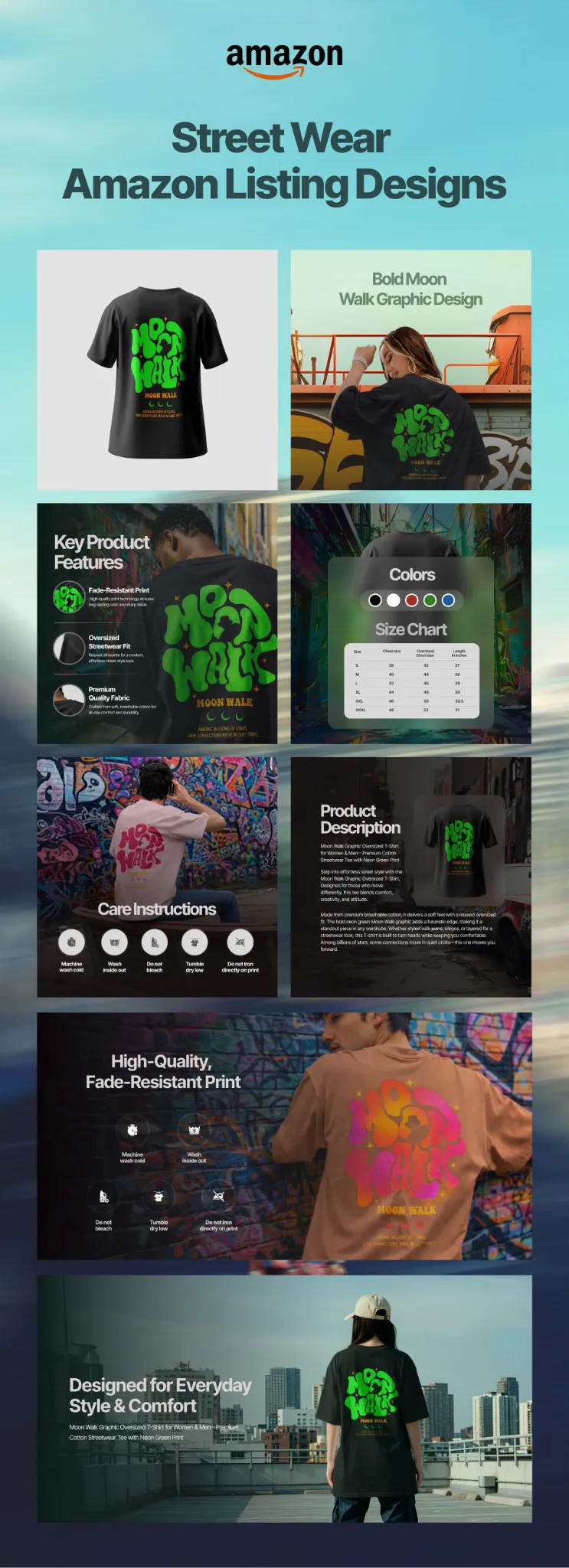
Amazon A+ listing design refers to the strategic creation of enhanced content modules - banner images, feature graphics, lifestyle photography layouts, infographics, and comparison charts - that appear in the A+ Content section of a product detail page.
Done well, Amazon A+ design combines brand aesthetics with conversion-focused layouts and Amazon's technical module specifications. Done poorly, it becomes the quiet reason a listing doesn't convert despite solid traffic.

9 Signs Your Amazon A+ Design Is Hurting Conversions
1. Your Banner Leads With Your Logo, Not a Benefit
This is the most common mistake in Amazon listing graphic design - and one of the most expensive.
Your full-width banner is the first thing a shopper sees after scrolling past the bullet points. Many sellers fill it with a lifestyle shot and a centred logo. It looks polished. It converts poorly.
Shoppers aren't browsing to admire your branding. They're trying to answer one question:
Is this the right product for me?
Your banner should answer that in under three seconds - with a visual that shows the product in use, a headline that communicates the core benefit, and a design that feels relevant to the buyer's actual life.
The fix:
Redesign your hero banner around a single, benefit-driven message. Show the product solving a real problem. Keep the logo small and secondary. Your brand story comes later in the module flow - the banner earns the scroll.
2. Your Modules Are Designed for Desktop Only
With over 60% of Amazon traffic now on mobile, a desktop-first design approach is outdated and risky.
This is a design problem, not a content problem. Side-by-side text-and-image modules that look clean on a wide screen collapse into unreadable stacked blocks on a phone. Tiny callout text becomes illegible. Feature icons disappear. Lifestyle images crop in ways the designer never intended.
The result: a mobile shopper lands on your listing, sees a compressed wall of images and small text, and leaves.
The fix:
Preview every module in Amazon's mobile view before publishing. Use larger font sizes in image overlays - minimum 20pt equivalent. Avoid placing critical text at the outer edges of images, where it will be cut off on smaller screens. Build vertically stacked, mobile-optimised modules as the baseline, not the afterthought.
3. You're Using Stock Photos Instead of Real Product Imagery
Shoppers don't always know what A+ Content is by name - but they absolutely register the difference between generic stock imagery and real product photography.
When a shopper sees a lifestyle image that could belong to any brand in your category, it signals one thing: we didn't invest in this product enough to photograph it properly. In competitive categories - electronics, health, beauty, home goods - that signal can be fatal. The listing with real, high-quality product photography wins the trust comparison every time.
This is one of the areas where working with an experienced Amazon graphic designer pays for itself quickly. A professional who understands Amazon graphic design knows how to use your existing product photos and build them into module layouts that actually convert - rather than reaching for generic stock as a shortcut.
The fix:
Invest in a proper product shoot before finalising your A+ content. At a minimum, you need: a clean white-background hero, 2–3 lifestyle shots showing context and scale, and at least one infographic-style image highlighting key features. If you're updating an existing listing, a specialist in Amazon listing graphic design can work with your existing photos and enhance them for module use.
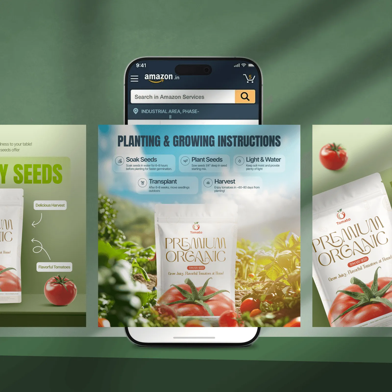
4. There's No Comparison Chart
Comparison charts remain one of the most underused tools in the Amazon A+ design toolkit. Many sellers skip the module because it feels like extra work. It's consistently one of the highest-converting modules available.
Why? By the time a shopper lands on your listing, they've already compared dozens of options. They want one final confirmation:
is this better than the alternative?
A well-built comparison chart answers that question visually - on your terms - before they go back to the search results to find an answer from a competitor.
The fix:
Add a comparison chart module that covers 2–4 variants of your own product (different sizes, tiers, bundles) or contrasts your product against the generic category standard - without naming competitors directly. Focus on the features your specific buyer cares most about, not everything.
5. Your Text Modules Are Too Copy-Heavy
Amazon shoppers in 2025 are smart, impatient, and visual. They skim. A+ content is where they pause - if it earns their attention. Long paragraphs of product copy inside A+ modules are the design equivalent of a brochure nobody asked for.
The design principle is simple:
show, don't tell. Every sentence that can be replaced by a visual should be. This applies whether you're managing Amazon graphic design in-house or briefing an external team.
The fix:
Audit every text module in your A+ content. If any block exceeds 4–5 lines, rewrite it as a feature icon layout, a headline with a one-sentence callout, or replace it with an infographic entirely. Keep body copy in A+ modules to 30 words or fewer per block.
6. Your Branding Doesn't Match the Rest of Your Listing
Visual inconsistency is a trust signal - and not the kind you want.
When a buyer scrolls from your product images (which use one colour palette and style) into an A+ section that looks like it was designed by a different team at a different time, something registers as off. They can't always articulate it. But confidence to purchase drops.
This is one of the most common gaps when sellers use multiple freelancers, switch Amazon graphic designers mid-project, or build A+ modules separately from their listing images without a shared reference.
The fix:
Before building or redesigning your A+ content, create a one-page brand reference sheet - primary colour hex codes, secondary colours, approved fonts, image tone (bright and clean vs. warm and lifestyle-led), and logo usage rules. Every module should be checked against this before publishing. If you're working with a professional Amazon A+ content design service, share this as part of the brief from day one.
7. You've Left the Image Alt Text Blank
This is invisible to shoppers - and almost universally skipped by sellers.
Every time you upload an image to your A+ content, Amazon asks you to add a short description. Most sellers leave these fields empty. That's both an accessibility failure and a missed SEO opportunity in a single step.
Alt text helps shoppers who rely on screen readers. It also helps external search engines like Google index your product imagery - which means your listings can appear in image search results outside of Amazon itself. For sellers who view Amazon listing graphic design as a long-term asset, this is a low-effort improvement with compound returns.
The fix: Write keyword-rich alt text for every A+ image. Keep each description to one or two sentences. Include your product name, primary keyword, and a brief description of what the image shows. Example: "Stainless steel insulated water bottle, 32oz, shown with condensation-free exterior on a hiking trail."
8. Your Module Flow Doesn't Follow a Conversion Structure
Good Amazon A+ design isn't just about individual modules looking great in isolation - it's about the sequence they appear in.
The best layouts mirror established persuasion frameworks like AIDA (Attention, Interest, Desire, Action). Most A+ content is built in the order the seller thought of things, not in the order a buyer needs to feel ready to purchase. The result: listings that look complete but don't close.
The fix:
Map your module sequence to the buyer's decision journey:
- Banner - core benefit + visual proof that earns the scroll
- Feature highlights - 3–4 specific reasons to buy, clearly visualised
- Lifestyle imagery - the product in a real-life context
- How it works / What's in the box - reducing post-purchase anxiety
- Comparison chart - confirming it's the right choice
- Brand story - building long-term trust
If your current sequence doesn't follow this arc, restructure before redesigning individual modules. The order matters as much as the content.
9. Your A+ Content Was Built Once and Never Updated
The best-performing brands in 2025 treat A+ content as a living asset - not a set-and-forget deliverable.
Customer reviews surface new objections. Seasonal campaigns call for updated imagery. New variants need to appear in comparison charts. Competitor listings evolve, and yours should too. Yet most sellers publish their A+ content once and only revisit it when something breaks.
A well-maintained Amazon A+ listing design compounds in value over time. A neglected one slowly falls out of alignment with what your buyers actually need to hear.
The fix:
Schedule a quarterly A+ content review. Ask:
- Are any lifestyle images seasonal or outdated?
- Have new objections appeared in recent reviews that the content should address?
- Has the comparison chart been updated to reflect current variants?
- Are conversion rates trending down - signalling that a refresh is overdue?

The Real Cost of Poor A+ Design
Here's the maths most sellers don't run:
If your listing gets 1,000 visitors a month and converts at 8%, you're making 80 sales. Fix your Amazon A+ design and lift conversions to 11% - well within the range Amazon's own data shows is achievable - and that's 110 sales. Same traffic. 37% more revenue.
The design investment pays for itself in weeks, not months.
What to Look for in an Amazon A+ Design Service
Not every graphic designer understands Amazon's ecosystem. When hiring for Amazon listing graphic design - or looking for a dedicated Amazon graphic designer - check for:
- Direct experience with Amazon's module specifications and approval guidelines
- A portfolio that shows real before-and-after listing transformations, not just standalone design samples
- A mobile-first design approach built into the workflow from the start
- Understanding of conversion structure - how modules flow together - not just how individual assets look
- Fast turnaround, because Amazon listing updates are time-sensitive around launches and peak campaigns
At Cueball Creatives, Amazon A+ content and listing design is one of our core services. We handle the full design stack - infographics, lifestyle module layouts, comparison charts, brand story banners - with a 24–48-hour turnaround and unlimited revisions. Whether you need a graphic designer for a single Amazon listing or ongoing design support across a full catalogue, we're built for it.
FAQ
What is Amazon A+ listing design?
Amazon A+ listing design is the visual creation of enhanced content modules - including banner images, feature graphics, lifestyle photography layouts, infographics, and comparison charts - that appear in the A+ Content section of a product detail page. Effective Amazon A+ design combines brand aesthetics, conversion strategy, and Amazon's technical module specifications into a layout that earns the scroll and drives the purchase.
What does a graphic designer for an Amazon listing actually do?
A graphic designer for Amazon listings creates the visual assets that make up your product detail page - main images, secondary product photos, infographic images, and A+ content modules. A specialist in Amazon graphic design also understands module sizing, mobile rendering, Amazon's content guidelines, and how layout structure affects conversion - not just how individual assets look.
How much does Amazon A+ content design cost?
Costs vary by provider and scope. Freelancers may charge ₹5,000–₹20,000 per listing depending on complexity. Specialist Amazon visual designer services and agencies typically charge more but deliver Amazon-compliant designs, faster turnaround, and structured revision cycles. Subscription-based design services like Cueball Creatives include Amazon listing graphic design within a monthly flat-fee plan, making it cost-effective for sellers managing multiple ASINs.
Does A+ content improve Amazon rankings?
A+ Content does not directly improve keyword rankings within Amazon's search algorithm. However, it improves conversion rate, reduces bounce rate, and increases dwell time - all of which signal product relevance and can indirectly support ranking performance over time. Additionally, alt text on A+ images is indexed by external search engines like Google, contributing to off-Amazon visibility.
How long does Amazon A+ content take to get approved?
Amazon typically reviews and approves A+ content within 7 business days. Working with a designer who understands Amazon's content guidelines reduces the risk of rejection and the delays that come with resubmission.
Can I update my A+ content after publishing?
Yes. Amazon allows edits and resubmissions at any time. Updates go through the same 7-day review process. It's recommended to review and refresh your A+ content at least once per quarter to keep it aligned with current customer feedback, active campaigns, and product line changes.
What's the difference between basic A+ and Premium A+ content?
Basic A+ content allows up to five modules and covers image-text combinations, comparison charts, and brand storytelling layouts. Premium A+ content unlocks up to seven larger modules, full-width imagery, embedded video, interactive hotspots, navigation carousels, and Q&A sections. Premium A+ typically delivers higher conversion lifts but requires a Professional selling account and brand registration in good standing.
Ready to Fix Your Amazon Listings?
If more than three of these signs apply to your current Amazon A+ content, your listings are leaving money on the table every single day.

.webp)
