Table of Contents
When you run a marketing-focused startup, the way you present your brand often becomes the deciding factor between a prospect showing interest or walking away. Many young companies invest heavily in digital ads, social media calendars, and outreach funnels, yet overlook one of the simplest but most powerful branding tools—a well-designed flyer.
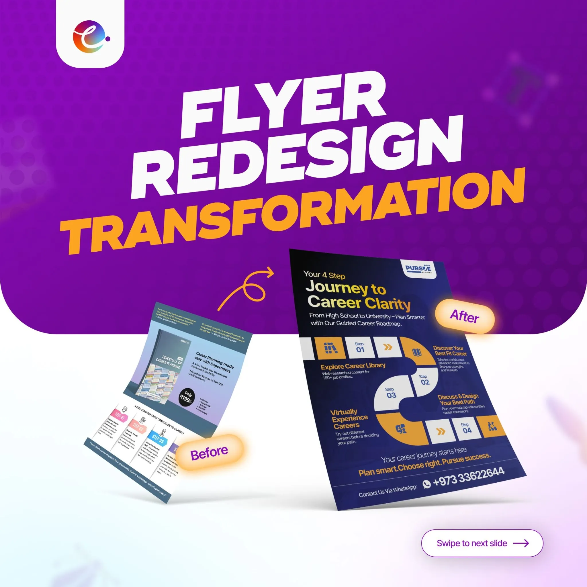
At Cueball Creatives, we often meet founders who understand the value of visibility but struggle with visual communication. One recent project, the Flyer Redesign Transformation, is a strong example of how thoughtful design can reshape clarity, improve engagement, and elevate brand credibility. This case study walks through the entire journey—from identifying the original design issues to creating a modern, high-converting flyer with multiple creative variations.
The goal of this blog is simple:
To help marketing startups understand how a smart flyer redesign can strengthen branding, communication, and customer trust—not just aesthetically, but strategically.
Understanding the Project: Flyer Redesign Transformation
The client approached Cueball Creatives with a flyer that was intended to guide students through a structured career-planning process. While the information was valuable, the presentation held it back. The layout felt cluttered, the headlines were not distinctive, and the visual hierarchy made it difficult for the viewer to understand the flow of information.
The objective became clear from the start:
To transform an outdated, text-heavy flyer into a modern piece of communication with improved readability, stronger visuals, and a more persuasive message.
For a marketing startup—or any business aiming to communicate value in seconds—this is exactly the kind of redesign that can shift perception.
The “Before” Stage: Key Issues Holding Back the Flyer
The original flyer suffered from several structural, visual, and messaging issues. Each of these problems is something we frequently see in early-stage marketing materials created without a design strategy.
Crowded Information Blocks
Almost every section of the flyer was filled with text sitting too close to each other. When information feels tight, the reader loses interest almost instantly. Instead of guiding the viewer, the layout overwhelmed them.
Weak Visual Focus
There was no hero element. Nothing stood out. When your eye searches for a starting point, comprehension slows down. A flyer must lead the viewer with intention—here, the message got lost.
Unclear Header Hierarchy
The headline didn’t look like a headline. Subheadings looked similar to regular text. Everything merged together, removing the clarity that is crucial for marketing startups trying to communicate quickly and effectively.
Confusing Design Hierarchy
Important points didn’t have priority. Lesser details got equal weight. This made the flyer feel visually flat, even though the content itself had depth.
Unengaging Information Flow
A marketing message should feel like a guided journey. But this flyer lacked a natural progression. The viewer didn’t know what to read first, what to understand next, or where to finish.

Generic Tagline
The tagline did not represent the emotion behind the service. It read like a placeholder, not a brand promise.
These problems combined reduced the flyer’s potential impact, making it visually dull and commercially weak.
The “After” Stage: How the Redesign Strengthened Branding
The redesigned flyer brought life back to the message. Instead of trying to force all information onto the page, we built a clean, modern experience that communicates confidence.
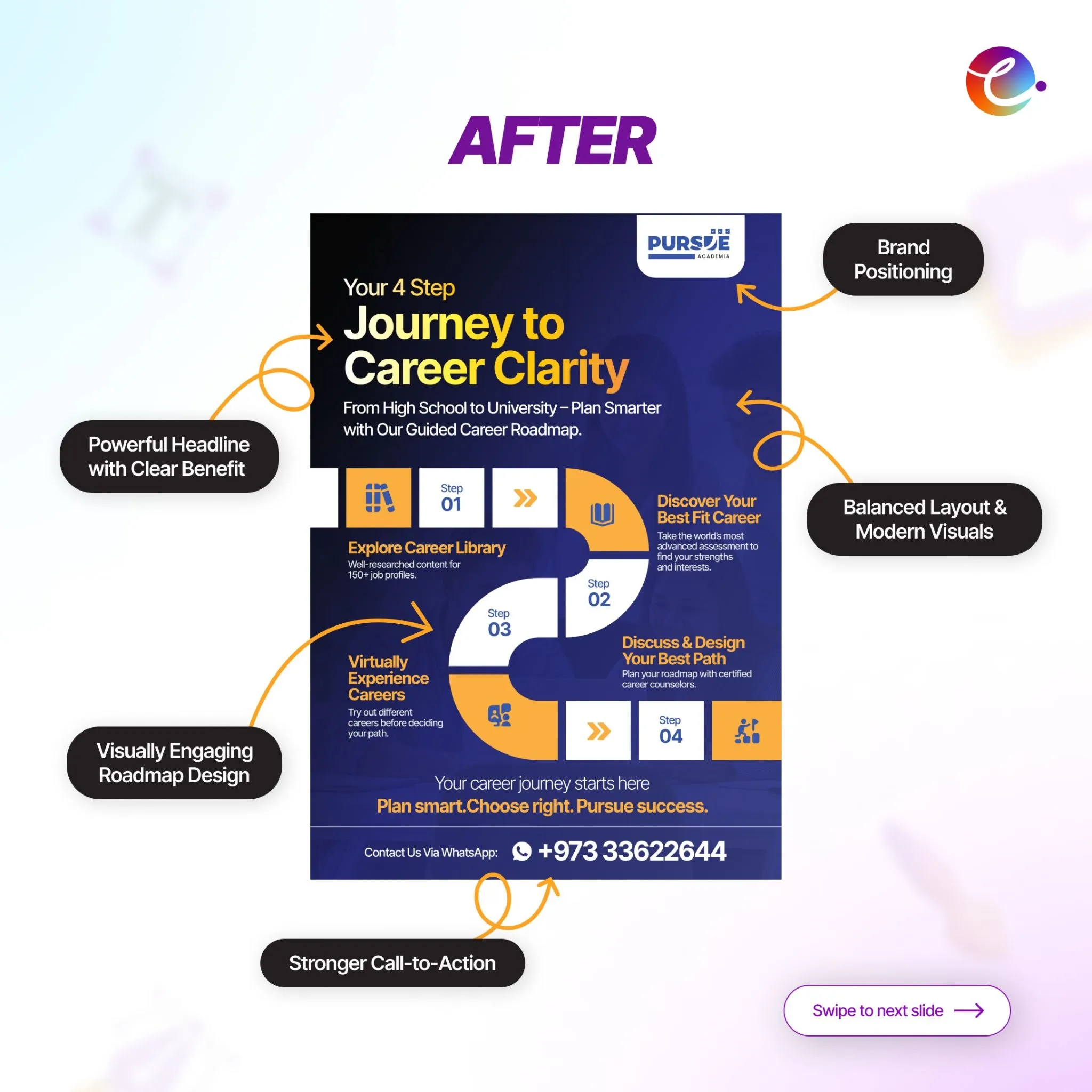
A Strong, Clear Headline
The new headline—“Your 4 Step Journey to Career Clarity”—instantly tells the reader what they’re about to discover. It’s simple, benefit-driven, and emotionally relevant to students and parents.
Balanced Layout & Modern Visuals
The clutter was removed. Spacing was added. Icons, color accents, and a modern visual language made the flyer feel premium and approachable at the same time.
Consistent Brand Positioning
The redesign aligned the flyer with the brand’s tone, visuals, and messaging. Cueball Creatives ensured the use of unified color palettes, typography, and icon styles to reinforce trust and recognition.
A Visually Engaging Roadmap
The heart of the redesign became a four-step roadmap featuring:
- Step 01: Explore Career Library
- Step 02: Discover Your Best Fit Career
- Step 03: Virtually Experience Careers
- Step 04: Discuss & Design Your Best Path
This not only improved comprehension but turned a plain list into a visual journey.
A Stronger Call-to-Action
The new CTA—
“Plan smart. Choose right. Pursue success.”
paired with a WhatsApp contact number, brought a sense of clarity and immediacy that was missing before.
A Clear Value Proposition
The redesigned flyer communicated the core benefit concisely:
“From High School to University — Plan Smarter with Our Guided Career Roadmap.”
This helped the flyer appeal to young students, parents, counselors, and decision-makers simultaneously.
Creative Variations: Giving the Brand More Options
Every marketing startup benefits from having multiple creative directions, especially when testing designs for campaigns. Cueball Creatives delivered four distinct variations:

Minimal & Elegant
This version embraced premium spacing, soft colors, and serif fonts. Ideal for institutions or audiences that prefer a refined look.
Bold & Youthful
Brighter tones, cheerful visuals, and lively typography made this variation perfect for students and teen-focused campaigns.
Structured & Clear
A grid-based design created a sense of order, supporting information retention while feeling professional.
Modern & Informative
This variation balanced icons, descriptions, and visual cues to deliver a clean, conversion-focused format.
Each variation served a different marketing intention, giving the client flexibility while maintaining brand consistency.
Final Promotional Slide
The project closed with a finishing message:
“Making Your Flyer Stand Out”
paired with a simple CTA:
“DM Us”
This works well on social media because it’s short, memorable, and visually appealing.
Key Highlights from the Case Study
To understand why this redesign mattered, it helps to look at the transformation from a strategic perspective.
Problem Statement
The original flyer was difficult to read, lacked structure, and did not reflect the brand’s value. Marketing materials that look outdated can reduce trust, even when the service itself is strong.
The Approach
Cueball Creatives carried out a complete audit of the old design, noted the hierarchy errors, rewrote the key messaging, restructured the layout using modern design principles, and prepared multiple creative variations for testing.
Results After Redesign
The new flyer felt more trustworthy, engaging, and clear. Viewers could instantly understand the service steps and connect with the brand. The strong CTA improved conversion opportunities, while the visual hierarchy guided the reader smoothly from top to bottom.
The redesign shown in this case study is more than a cosmetic upgrade—it’s a demonstration of how thoughtful design improves branding and communication for marketing startups.
Why Flyer Redesign Matters for Marketing Startups
Startups often operate with limited time, tight budgets, and fast-moving goals. Many rely on internal teams or generic templates for early marketing materials, which is understandable but often ineffective.
A flyer is usually the first physical or digital touchpoint that a customer sees. If it looks weak, trust drops. If it looks polished, credibility rises instantly.

This is especially true for startups marketing, whose clients expect clarity, creativity, and strategic communication. A flyer isn’t just a piece of information—it’s a reflection of how the brand thinks.
A professional flyer redesign:
- Improves messaging clarity
- Creates a smoother reading experience
- Boosts perceived brand value
- Strengthens conversion opportunities
- Helps maintain consistency across campaigns
When done well, a flyer becomes an asset that supports email campaigns, ads, brochures, events, and digital funnels. For growing startups in the USA, India, or any global market, this consistency is what sets strong brands apart.
FAQs
How does flyer redesign help marketing startups improve branding?
A redesigned flyer improves branding by creating clearer messaging, stronger visuals, and a better user experience. It helps startups communicate professionally, build trust, and attract higher-quality leads.
What makes the redesigned flyer in this case study more effective?
The new flyer features a structured roadmap, cleaner layout, consistent branding, and a persuasive call-to-action. Each element works together to guide the viewer and encourage action.
Why is visual hierarchy important in flyer design?
Visual hierarchy helps people understand information quickly. When headings, icons, spacing, and colors are used correctly, the reader naturally follows the intended flow without confusion.
Are creative variations necessary for startups?
Yes. Different audiences respond to different visual styles. Offering multiple variations helps brands test, refine, and choose the most effective design for each campaign.
How does Cueball Creatives approach flyer redesigns?
Cueball Creatives audits the existing design, identifies clarity issues, rebuilds the layout using modern UI principles, improves messaging, and delivers multiple high-quality variations suited to the brand.
Where Clarity Meets Creativity Cueball Creatives at Your Side
Great design has a quiet strength. It doesn’t make noise—yet it leaves a deep, lasting impression.
For marketing startups trying to build trust in competitive markets across the USA, India, and worldwide, a well-designed flyer can completely change how people see your brand.
Our recent Flyer Redesign Case Study proved this again. With a smarter content flow, modern visuals, and consistent branding, we transformed an ordinary flyer into a high-impact marketing asset. This is exactly what we do at Cueball Creatives - not with loud promises, but with clear communication, clean design, and creativity that actually delivers results.
If your startup wants to communicate better, strengthen your brand identity, or refresh your marketing materials, a flyer redesign is one of the simplest—and most effective—ways to start.
Cueball Creatives is here to help you make that shift from “just another startup” to a brand people remember.