.png)
Table of Contents
Spider-Man: Brand New Day hits theaters July 31, 2026, and the marketing machine is already in full swing - teaser posters, a new suit, a new trailer, a new tagline: "It's a Brand New Day for Peter Parker." Whatever you think of the movie, the rollout itself is a masterclass in graphic design. Sony and Marvel are managing one character across a poster, a trailer, a title card, merchandise, and a dozen social platforms in a dozen countries, and it all has to feel like the same character everywhere it shows up.
That's the exact problem every growing business has with its own branding - just at a smaller scale, and usually without a Marvel-sized budget or team to solve it. Here are seven design lessons pulled from how Marvel builds (and rebuilds) Spider-Man's visual identity, and how to apply them whether you're running a startup in Austin, an ecommerce brand in London, or an agency serving clients across Dubai and Singapore.
Quick answer: The core lesson is consistency under change. Spider-Man's suit, logo, and color palette evolve with every film, but three things never move - the silhouette, the red-and-blue contrast, and the web-motif detailing. That's the same discipline good visual identity design needs: room to evolve without losing recognizability, no matter which country or platform your brand shows up in.
1. A logo has to work in the dark - literally
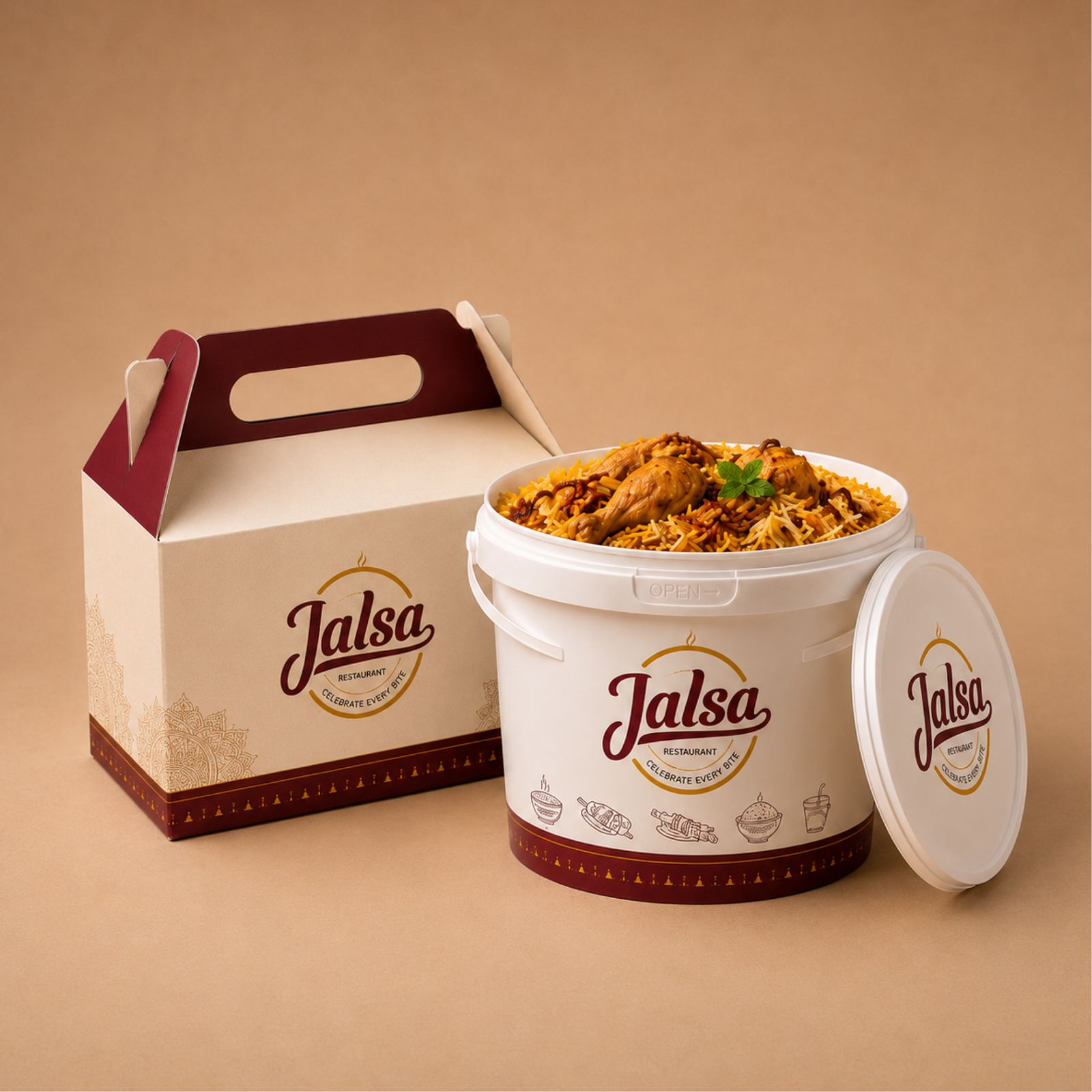
Spider-Man's emblem is designed to read clearly whether it's on a bright red suit in daylight or barely lit in a rain-soaked action scene. That's not an accident. Marvel's design team builds the logo to hold up in low contrast, small sizes, and motion - because that's where it actually gets seen.
Most small business logos are only ever tested on a white background in Canva. They fall apart the moment they're on a dark Instagram Story, a stitched hoodie, or a favicon at 16 pixels. Before you finalize a logo, test it in grayscale, at thumbnail size, and on your darkest and lightest brand colors. If it disappears in any of those, it's not done. This is exactly the kind of stress-testing a real logo design service builds into the process instead of skipping it.
2. Reinvention only works if you keep the DNA
"Brand New Day" is literally about reinvention - Peter Parker in a world that's forgotten him, forced to rebuild his identity. But look closely: the suit changes, the story changes, the supporting cast changes - and the core silhouette, the web pattern, the red-and-blue never do. Marvel understood that a full identity reset would break 60+ years of brand equity. So they evolve the wrapper, not the DNA.
This is the single biggest mistake we see in rebranding services requests: business owners want a brand new logo, new fonts, new colors, all at once, because they're bored of their own brand. Customers aren't bored of it - they just stopped noticing it. A good rebrand keeps at least one strong recognition anchor (a color, a mark, a type treatment) and evolves everything else around it. Total resets should be reserved for genuine repositioning, not fatigue.
3. Motion tells the origin story faster than a static image ever could
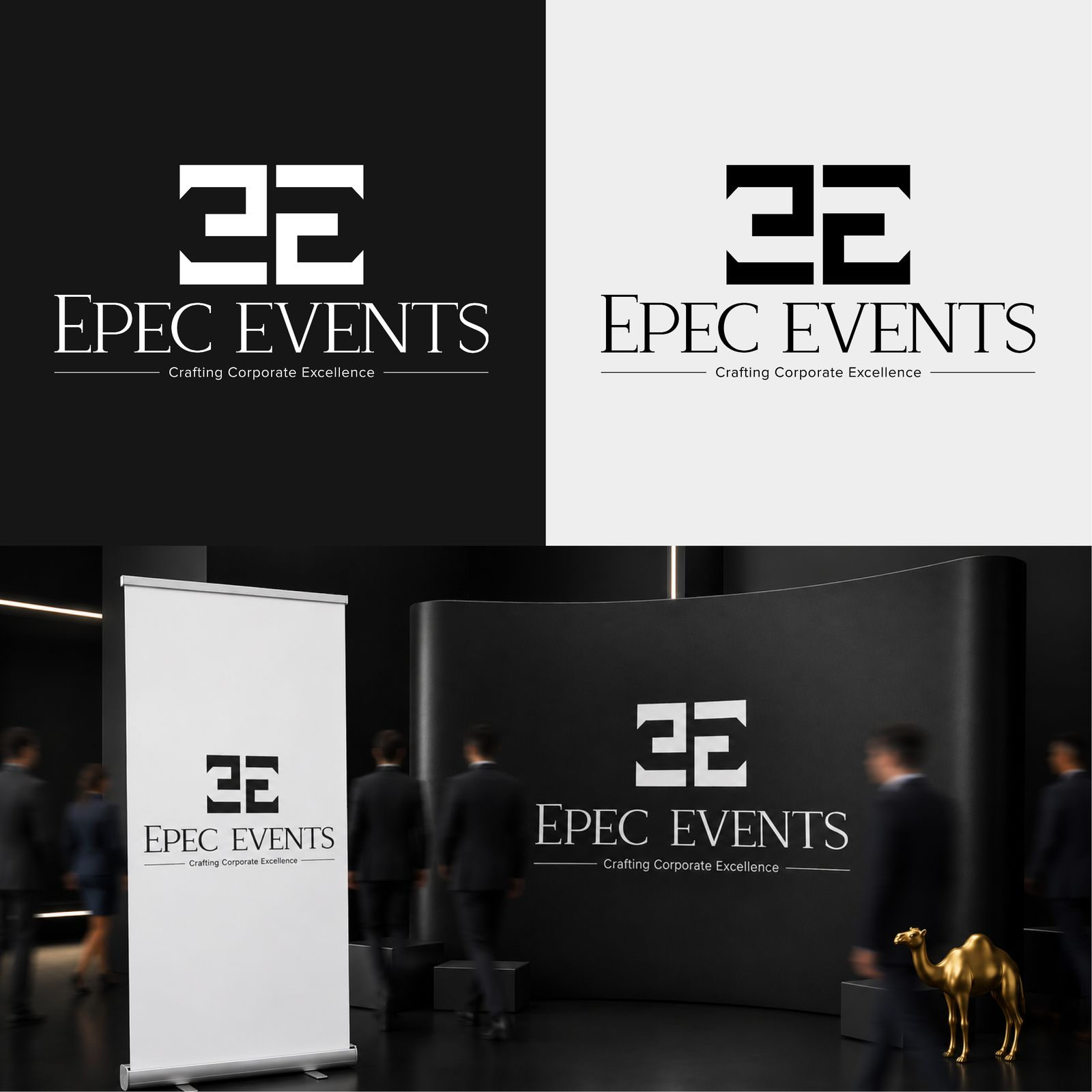
The first teaser trailer did more brand-building in 90 seconds than any poster could. Movement showed how the new suit reacts to light, how the web-shooters fire, how Peter's body language has changed since No Way Home. Static images tell you what something looks like. Motion tells you how it behaves - and behavior is what people actually remember.
If your brand only exists as static logos and slide decks, you're leaving the most persuasive format on the table. A 15-second product demo, an animated logo sting, or a founder-story reel consistently outperforms static creative on watch time and shares. This is the whole case for motion graphics services - not because video is trendy, but because it's a fundamentally more convincing format for showing how something works.
4. Color is doing the talking before anyone reads a word
Red and blue, at full saturation, is one of the most recognizable color pairings in entertainment - you know it's Spider-Man from a silhouette alone, before you see a single web pattern. That's what a real color strategy does: it identifies you before your logo or your name even loads.
Most brands pick colors because they "look nice," not because they're building recognition. Test this: strip your website down to just your color palette and shapes, no logo, no text. Would a regular customer still guess it's you? If not, your palette isn't doing enough work. This is the practical output of proper visual identity design - colors chosen for recognition, not just aesthetics.
5. One character, twenty formats, zero inconsistency
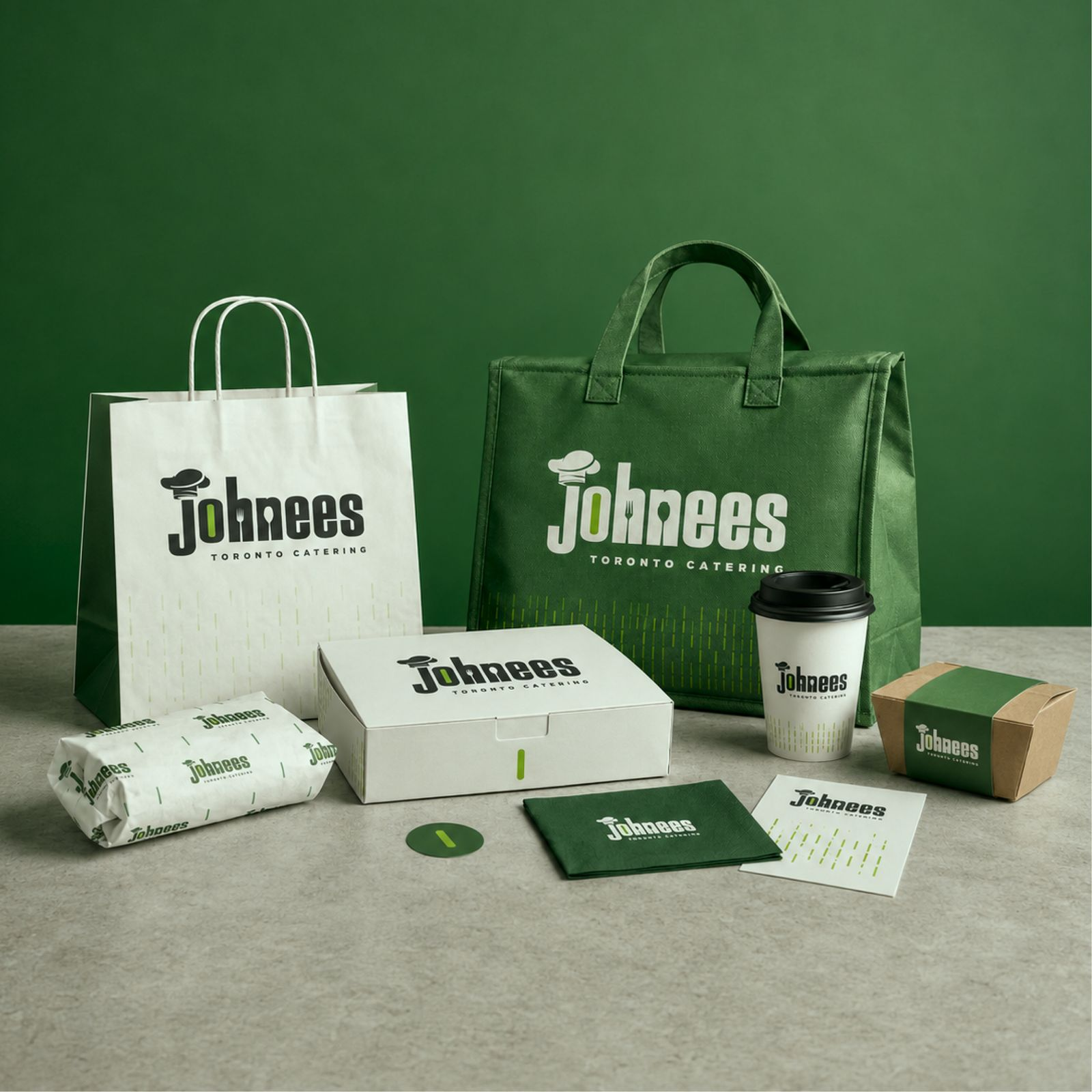
By the time Brand New Day releases, Spider-Man's likeness will have appeared on posters, trailers, toy packaging, a mobile game tie-in, fast food cups, and a hundred fan-made memes - and it will still look like the same character everywhere. That's not luck. It's a locked style guide that every vendor, from toy manufacturers to ad agencies, is required to follow.
Most small businesses don't have that discipline because they don't have that infrastructure - a different freelancer handles social graphics, another does the website, a cousin made the original logo in 2019. The output looks like three different companies, and it gets worse the moment you sell into more than one country, where fonts, layouts, and even color meanings don't always translate the same way. This is precisely the problem an unlimited graphic design service

solves: one team, one brand file, applied consistently across every format and every market you operate in, instead of a patchwork of one-off freelancers.
6. Villain design exists to create contrast, not to compete
Marvel's antagonist designs are deliberately built to visually contrast the hero - different silhouette, different palette, different texture - so the eye never confuses who's who, even in a chaotic action frame. That's a hierarchy decision, and hierarchy is the most underrated skill in graphic design.
On a website or a slide deck, your primary CTA should be as visually distinct from everything else as a villain is from Spider-Man. If your "Buy Now" button uses the same color and weight as your body text, you've built a page with no hierarchy - everything competes for attention, and nothing wins. This is core to good UI work, and it's why UI UX design services spend real time on contrast and visual weight, not just layout.
7. The campaign is bigger than the movie - plan for every asset up front
Marvel doesn't design a poster and improvise the rest. Before a trailer drops, there's already a plan for the social cutdowns, the press stills, the merch mockups, and the international poster variants. One creative direction, dozens of deliverables, built from a single brief.
Most businesses do the opposite - they design a logo, then scramble asset-by-asset every time a new need comes up (a pitch deck here, an Instagram carousel there), with no system tying it together. A startup branding agency worth paying for starts with the full asset map - logo, socials, pitch deck, packaging, ads - so nothing gets designed in a vacuum later.
How to actually apply this to your brand
You don't need a Marvel budget to use any of this. Start with an honest audit:
- Does your logo hold up in grayscale, at small sizes, and in motion?
- If you rebrand, what's the one element you're not allowed to change?
- Do you have any motion assets at all, or is everything static?
- Would someone recognize your brand from color alone?
- Is one team producing your visuals, or is it scattered across freelancers?
- Does your primary CTA visually dominate the page, or blend in?
- Do you have a single brief that every new asset gets built from?
If you answered "no" to more than two of these, that's not a branding failure - it's a process gap. It's fixable, and it's usually cheaper to fix with one consistent team than to keep patching it with one-off freelance jobs.
FAQ
What can businesses actually learn from movie marketing design?
Movie studios manage one identity across dozens of formats and vendors without losing consistency - the same discipline small businesses need but rarely build. The lessons scale down: hierarchy, color recognition, and format-testing apply at any budget.
Why does Spider-Man's suit change in every movie but still look recognizable?
Because the silhouette, color pairing, and web-motif detailing stay fixed while surface details evolve. That's a locked "brand anchor" - the same principle behind any successful rebrand that keeps its equity intact.
Do I need video content for my brand, or are static graphics enough?
Static graphics still matter for logos and print, but motion consistently outperforms static content for demonstrating how a product or service works. If you have zero motion assets, that's a real gap worth closing.
How much does a startup branding agency typically cost?
It varies widely by scope - project-based logo work runs a few hundred to a few thousand dollars, while ongoing brand support is usually priced as a monthly retainer or subscription. Book a discovery call for a scoped quote based on your actual asset needs.
What's the difference between a rebrand and a refresh?
A refresh updates surface elements - colors, type, minor logo cleanup - while keeping the core identity intact. A full rebrand changes the identity itself, usually because of a genuine repositioning, not just visual fatigue.
Is an unlimited graphic design subscription worth it for a small brand?
If you need more than 2-3 design pieces a month across multiple formats (social, web, print, decks), a subscription is usually cheaper and faster than hiring a freelancer per project, and it keeps one team accountable for consistency.
How do I know if my logo has good contrast and hierarchy?
Convert it to grayscale and shrink it to favicon size. If it's still legible and recognizable, it passes. Do the same test on your website's primary CTA against its background - it should be the most visually dominant element on the page.
Can a small business build a consistent brand without a big agency?
Yes, but it requires a single style guide and one team (in-house or outsourced) enforcing it across every asset. The failure mode isn't budget - it's fragmentation across too many disconnected freelancers.
Ready to build a brand that holds up across every format - and every market?
Cueball Creatives runs on the same principle as any well-managed franchise: one creative team, one consistent brand system, applied across logos, social, motion, and web. We already do this for clients across the USA, UK, Canada, Australia, UAE, Singapore, and Bulgaria, so whether you're a single-market startup or scaling internationally, the same consistency discipline applies.
If you recognized more than two of the gaps above in your own brand, that's the actual starting point - not the movie trivia. Book a discovery call to get a scoped plan for your brand, view our portfolio to see the work, or start your free trial to see how an unlimited design subscription replaces a patchwork of freelancers with one accountable team.
.webp)